[icopyright horizontal toolbar]
Lines
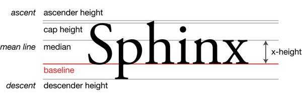
The vertical dimensions of a typeface are defined by five virtual lines:
- Topline (Ascender Height): The topline is where the tallest letters terminate. For instance, the ascender of the letter h rises from the median line to the topline.
- Cap Height Line: The line delineating the top of capital letters, like S. Note that the topline is different from the cap height line.
- Median (Mean Line): The median line is where smaller letters like x top out, as does the torso of h. Notice how the torso of the h kisses the median line, whereas the letter n pierces the line. The x-height is the distance between the baseline and the mean line.

- Baseline: If you think of ruled notebook paper, you understand baselines, where the bottom of letters like n and x sit. Even when you remove the ruled line, the baseline is still there, virtually supporting the row of letters.
- Beardline (Descender Height): In the picture of the word Sphinx, note the letter p: the body sits on the baseline, but the descender rests on the beardline.
Each character in a font uniquely interacts with the five lines that establish each character’s vertical dimension. Font designers enjoy working within the constraints of long-established rules concerning the vertical axis. Some designers stay within the lines, others break through. For instance, notice the top serif of the letter i in Sphinx pierces the mean line, and does so at an interesting angle. The effect is echoed in the letter n that follows.
Leading
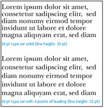
The distance from one baseline to the next is called leading. The vertical rhythm of a page is defined by the degree of leading employed. Leading determines whether the page seems crowded, pleasant, or empty. When a font’s point size is equal to the distance between corresponding lines, the font is said to be set solid. For example, a 12 point font that is set solid will have its baseline 12 points below the previous baseline, expressed as 12/12. If you introduce an additional two points of leading, then 14 points separate the two baselines, expressed as 12/14. Now the font has enough breathing room to look uncluttered on the page.
To specify a line of type, you must also include the line length. If our 12/14 line is 22 picas long, it would be correctly specified as 12/14 x 22, which means a 12 point font with two points of leading and a line length of 22 picas. A title may have negative leading (e.g. 18/16) as long as ascenders and descenders don’t collide.

Leading Rules
Some leading rules:
- Bold or dark fonts require more leading than lighter fonts.
- Longer lines require more leading than shorter lines.
- Serif fonts need less leading than san-serifs.
- Big-faced types demand more leading than slender faces.
- If your text uses mathematical formulas or subscripts and superscripts, you will need to add leading for clarity.
- Unless you are seeking special effects (say, for poetry), leading should align uniformly on a page, across two pages, and on the front and back of the same page.
- A language with a lot of capitalization, such as German, requires more leading to look uncrowded.
Intrusions
Despite the predominance of uniform leading, a typesetter can experiment with the leading of headings, captions, text blocks and other intrusions to break up the monotony on a page. All non-standard leading should be sized in a multiple of the text’s normal leading, so as not to disrupt the rhythm of the standard text.
Subheadings make possible a lot of different leading choices. If we have a 12/14 font, we should ensure that the total vertical space taken up by the subhead be a multiple of 14 points. You might create a balanced effect by using small caps 12 points high with 14 points of leading above and 14 points below. Alternatively, you can lower the subheading by applying 16 points of spacing above and 12 below. You could even try negative leading with a 15/14 subheading. The page designer can have lots of fun making these interesting decisions for all kinds of non-regular intrusions.
Lastly, you want to ensure that your page has breathing room. If you see your page is appearing cluttered but you must maintain a high word density, you can introduce multiple columns, which lend roominess to otherwise tightly-leaded text.
Click here for reuse options!Copyright 2011 Eric Bank, Freelance Writer