[icopyright horizontal toolbar]
Monospaced Font
Font Size and Word Space
The units of font size are the point and the pica. Their values have evolved over time to the modern definition: a point is 1/72 of an inch, and a pica is equal to 12 points, or 1/6 of an inch. However, the unit of horizontal measurement is the em, which is equal to a font’s point size. Thus, a 12-point font has an em size of 12 points. A one-em space remains proportionately the same no matter the point size. Ems can be subdivided into any number of equal divisions; half an em is called an en.
Proportional Font
Word space is, unsurprisingly, the space between words. There is no one optimal word space; an ideal word space depends on factors such as justification, color, and letterspace (the space between letters). By justification, we mean that a paragraph’s right margin can be either ragged or elastic, depending on whether the word space is fixed or justified. A word space that measures a quarter of an em is fairly typical. Poor word spacing requires the reader to focus energy deciphering text, not something for which a typesetter would be proud.
Letterspacing
The space between adjacent capital characters can vary about five to ten percent of the type size. A modern font system such as PostScript (PS) divides an em into 1000 units, so letterspacing may use up 50 to 100 PS units. For headings and titles, additional letterspacing is often desirable, up to 25 percent of the type size. This extra horizontal space often requires more vertical space between lines.
Letterspacing is usually not needed for lowercase letters, although it is sometimes seen in ultra-modern fonts.
Note that letterspacing is distinct from kerning. The latter is extra space added between particular pairs of characters to enhance legibility.
Line Length
Standard line lengths (or measures) vary from about 45 to 75 characters and spaces. You can fit more characters onto a line if you increase the vertical space between lines (the leading), but only up to a certain point. If you use too few words on a justified line, you encounter “white acne”, or a series of unsightly white spaces. That’s the reason short lines should be set ragged right rather than justified.
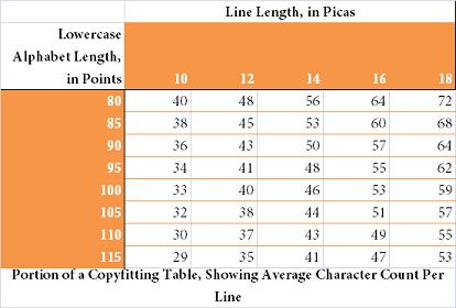
It’s fairly typical for a line length to be 30 times the font size, but can range from a minimum of 20 times to a maximum of 40 times. A copyfitting table is used to estimate the character count on a line of text. It is a table of line lengths, in picas, versus the length of the font’s lowercase alphabet, measured in points.
For example, a 10-point font should look pleasing set at 300 points (25 picas). If you measure the lowercase alphabet of a particular 10-point font, you would typically find a length of approximately 128 points (1.78 inches). Look up 25 picas versus 128 points in a copyfitting table, and you’ll discover that the comfortable line length for this font is around 65 characters.
Raggedness
In this digital age, we are used to justified font – flush left and right. However, ragging is appropriate in a number of situations: short lines, monospaced (as opposed to proportional) fonts and text that, when justified, results in hyper-hyphenated lines. A lot of software always applies some justification, even when a ragged line is desired. A hard rag is one in which there are fixed word spaces, no letterspacing, no minimum measures, and no extra hyphenation.
Other Considerations
There are a few rules of thumb that affect the horizontal movement:
- Don’t letterspace lower-case characters unless you desire a special effect.
- Use a single space between sentences, anything more is a waste.
- Don’t add space around initials. For instance, use U.S.A. not U. S. A.
We’ll pick up our discussion of horizontal movement next time with a look at kerning.
This article rendered in Crimson 10pt.
Subscribe to Eric Bank, Freelance Writer
Click here for reuse options!Copyright 2011 Eric Bank, Freelance Writer


